Photogrammetry
Mapping of spaces with iPhone
RISD M.Arch Design
RISD M.Arch Design
Date: Spring 2020.
Location: Bapst Library, BC Campus, MA.
Materials: Metashape Pro, Rhino, Photoshop.

Mapping and exploration of vaults, colour, and texture.
The goal
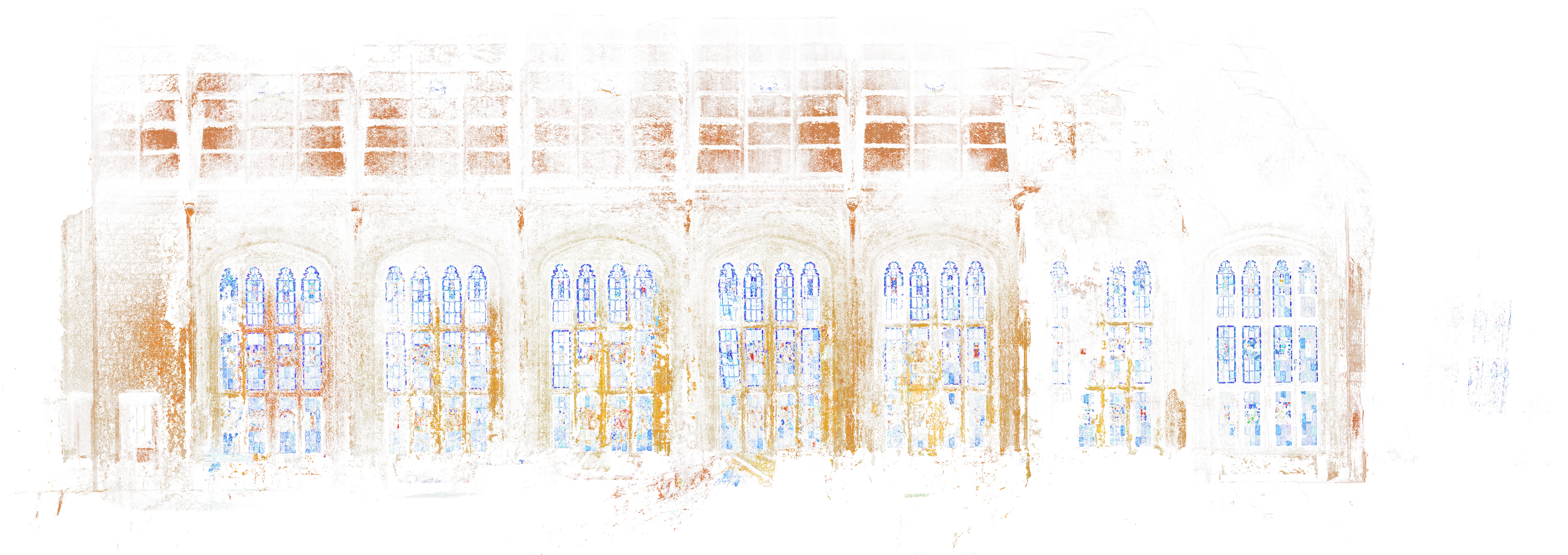
I wanted to explore how I could think about buildings and the transition of spaces only by looking at light, the saturation of colour, and the role of the “architectural drawing” being entirely made based on elements that are not traditionally represented for a basic understanding of the building.
Bapst Library
I chose to do the study at Bapst Library on the Boston College campus. The procession into this library is unique. The stone used for the library appears across the campus, unifying the buildings. This light stone is the only material in the building, from the front door, through the processional staircases, and into the gallery until one enters the main hall. The main hall has additional materials mimicking outside (the long green carpet and dark timber framing). The library also allowed me to think about organic tonal interactions between materials, i.e. connection and treatment of stone, wood, stained glass, and textile.
I chose to do the study at Bapst Library on the Boston College campus. The procession into this library is unique. The stone used for the library appears across the campus, unifying the buildings. This light stone is the only material in the building, from the front door, through the processional staircases, and into the gallery until one enters the main hall. The main hall has additional materials mimicking outside (the long green carpet and dark timber framing). The library also allowed me to think about organic tonal interactions between materials, i.e. connection and treatment of stone, wood, stained glass, and textile.


Discoveries
Using photogrammetry can not only map space, but when used as a design tool, it starts to blur hierarchies and directional qualities of the building. A flattening begins to happen that, while only the interior space is mapped, reads as directionless. The interior is shown and represented as both inside and outside at once.
Discoveries Cont.
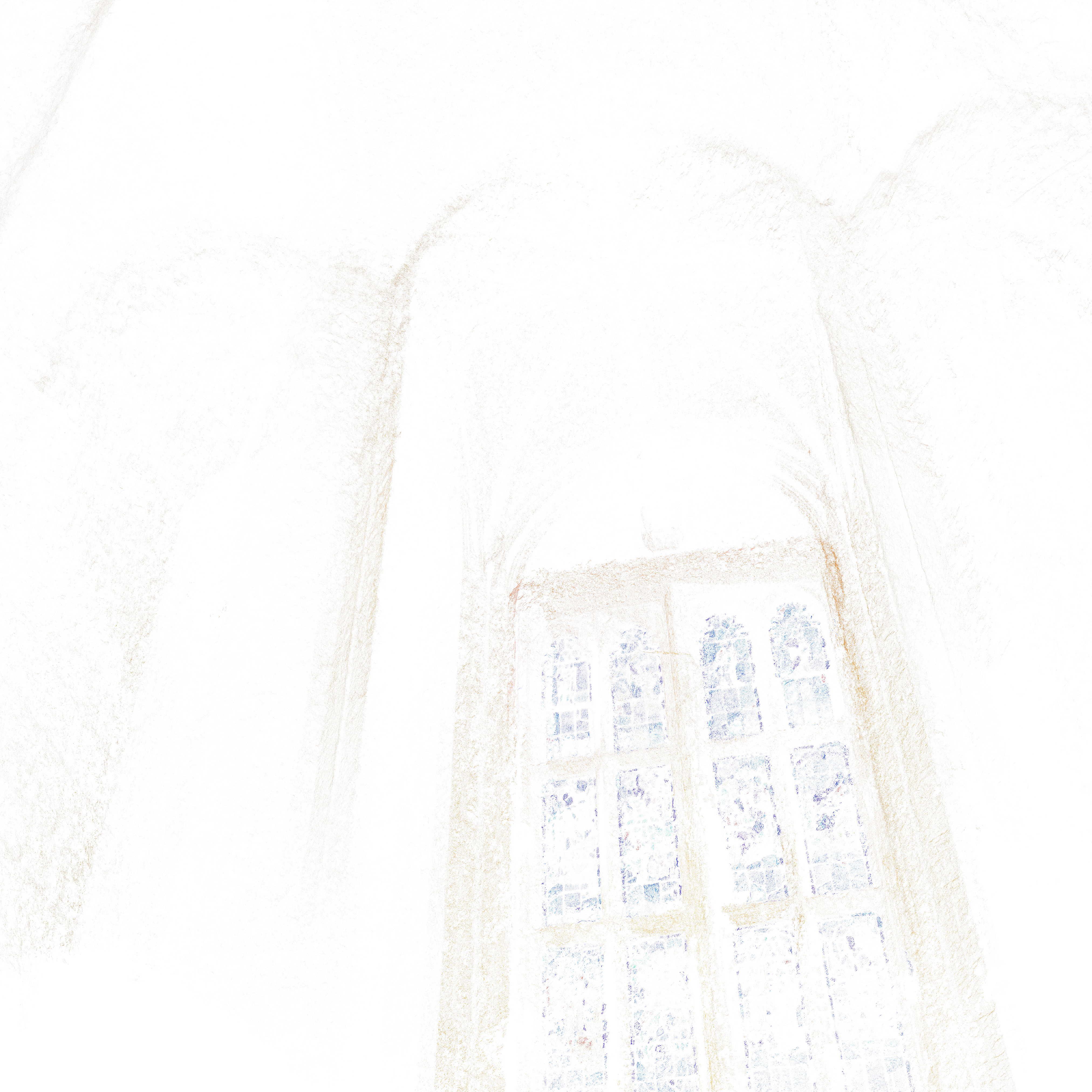
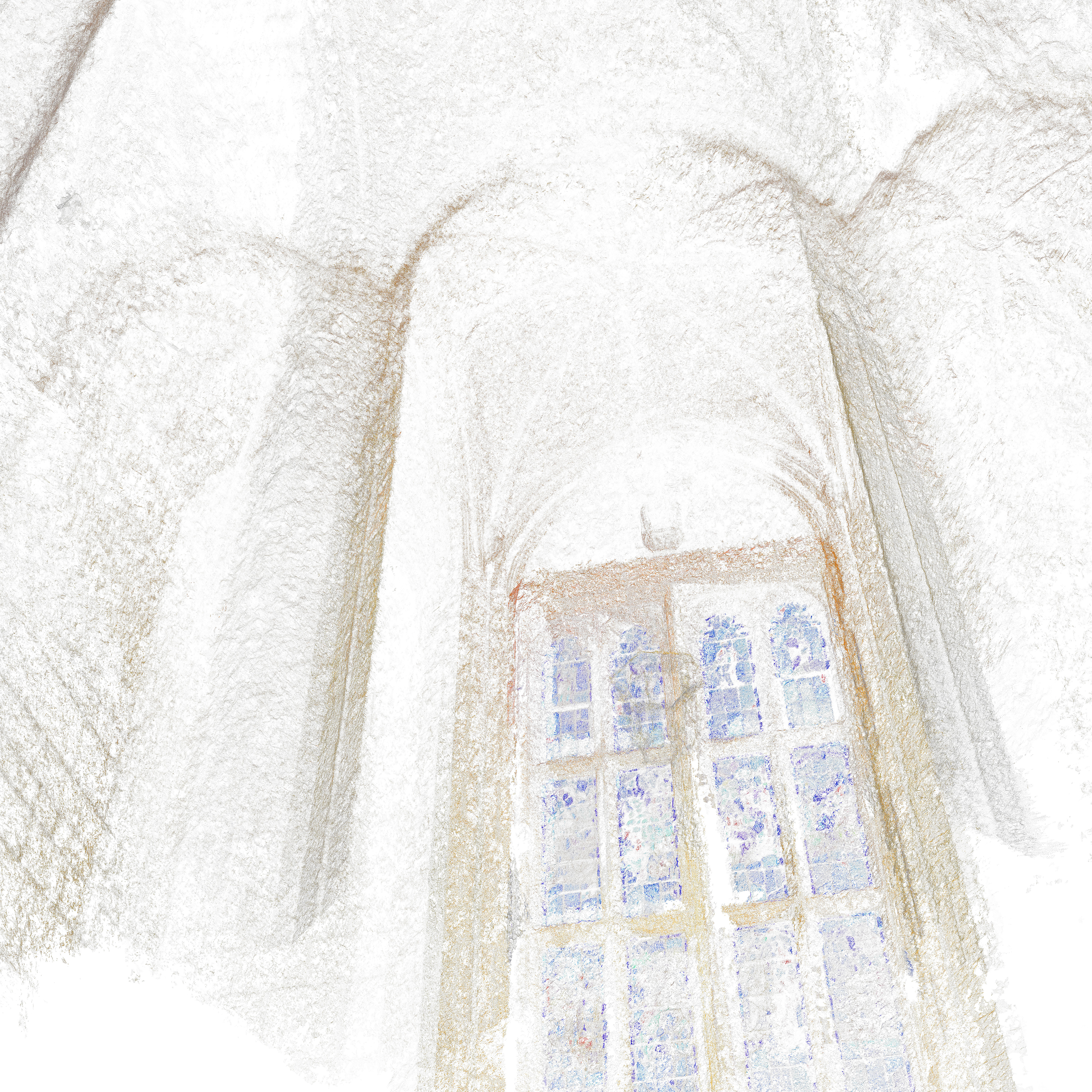
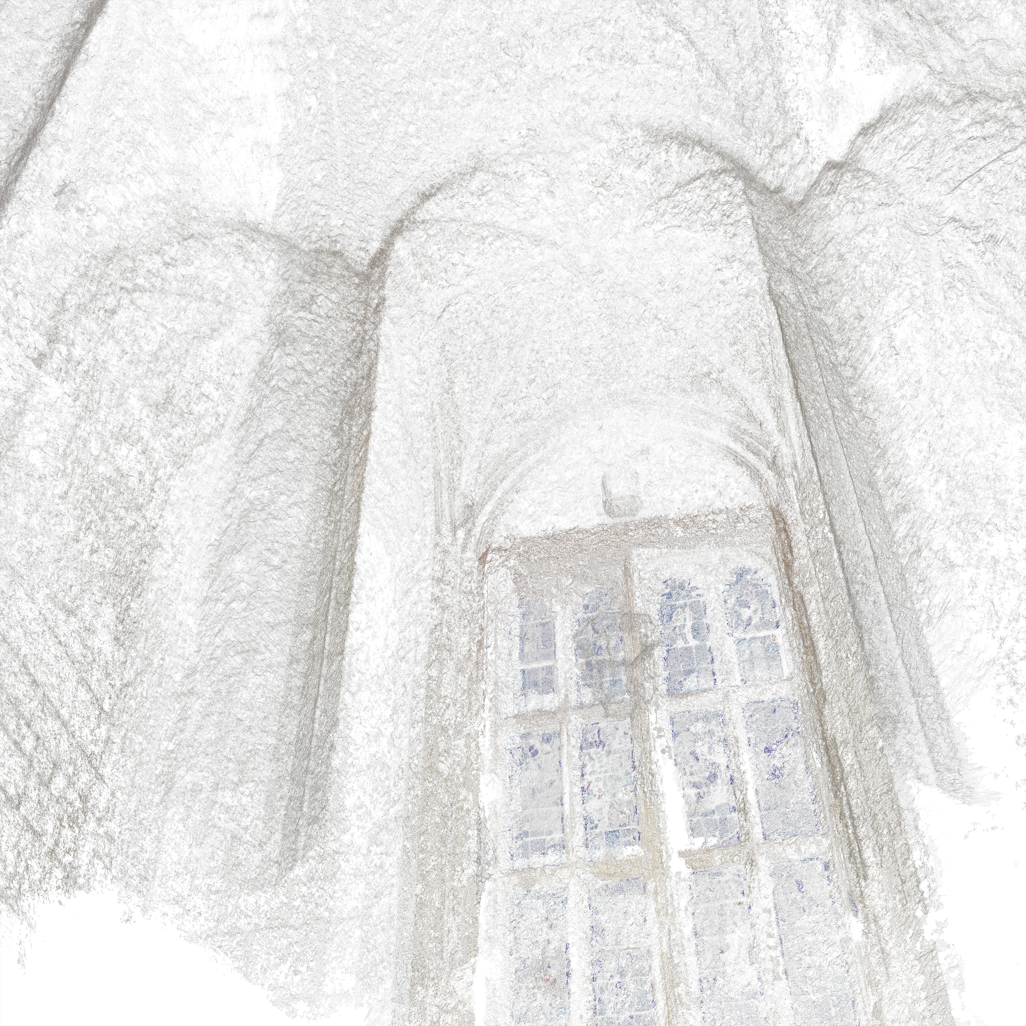
Controlling the density of the point cloud changed how I perceived the space depending on the amount of information shown. Depth of space and the visual language of diagramming these spaces can have different impacts depending on the background colour. Throughout this exploration, one thing became apparent. The undertone of the material gave a more impactful visual effect than the “actual” colour. The undertone mixed with different degrees of density changed how I perceived texture and solid void mass. For example, the stained glass windows became flattened with the colour of the sky outside. They turned this ornamental, decorative, and translucent material into something with the same importance as the stone from which the Bapst Library was built.

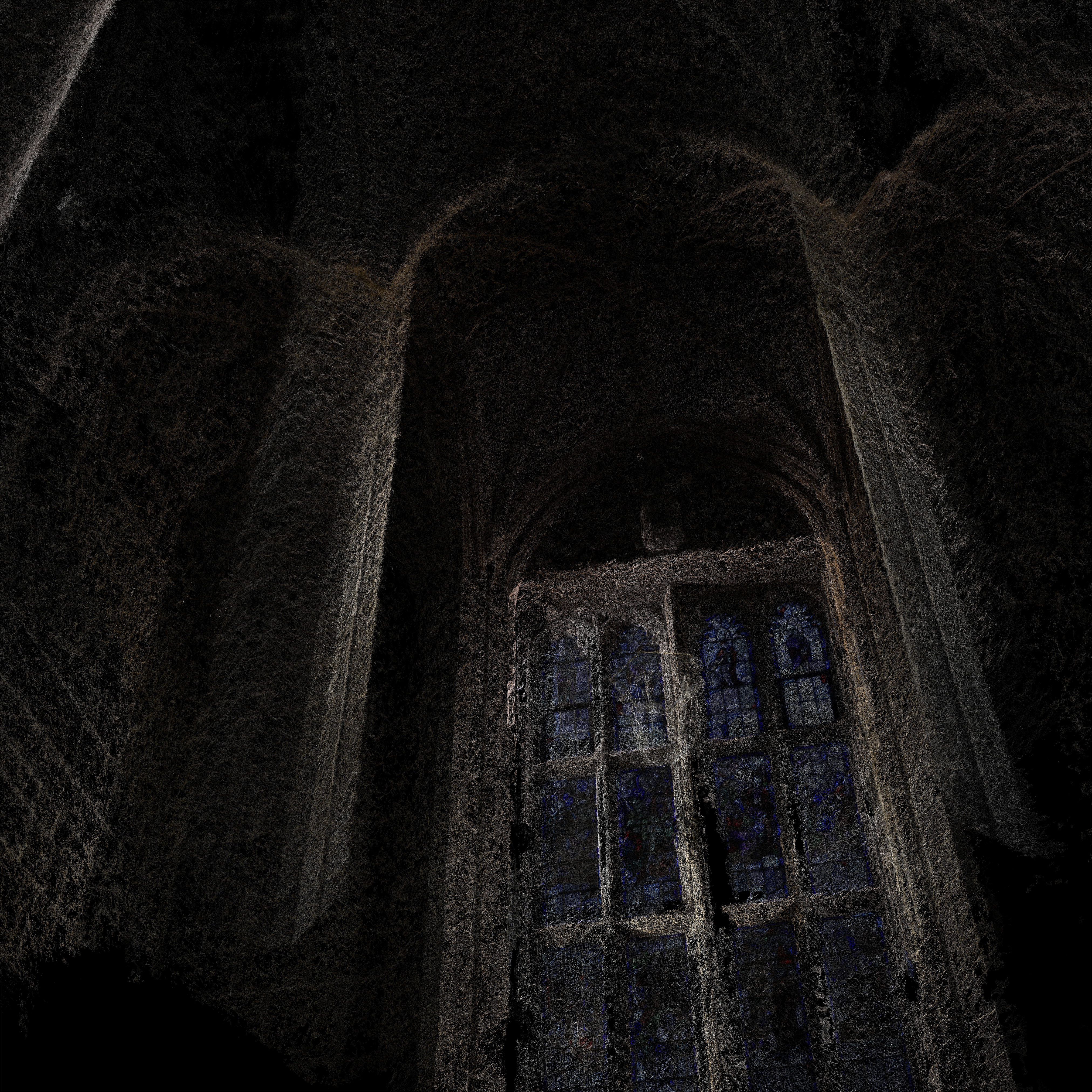
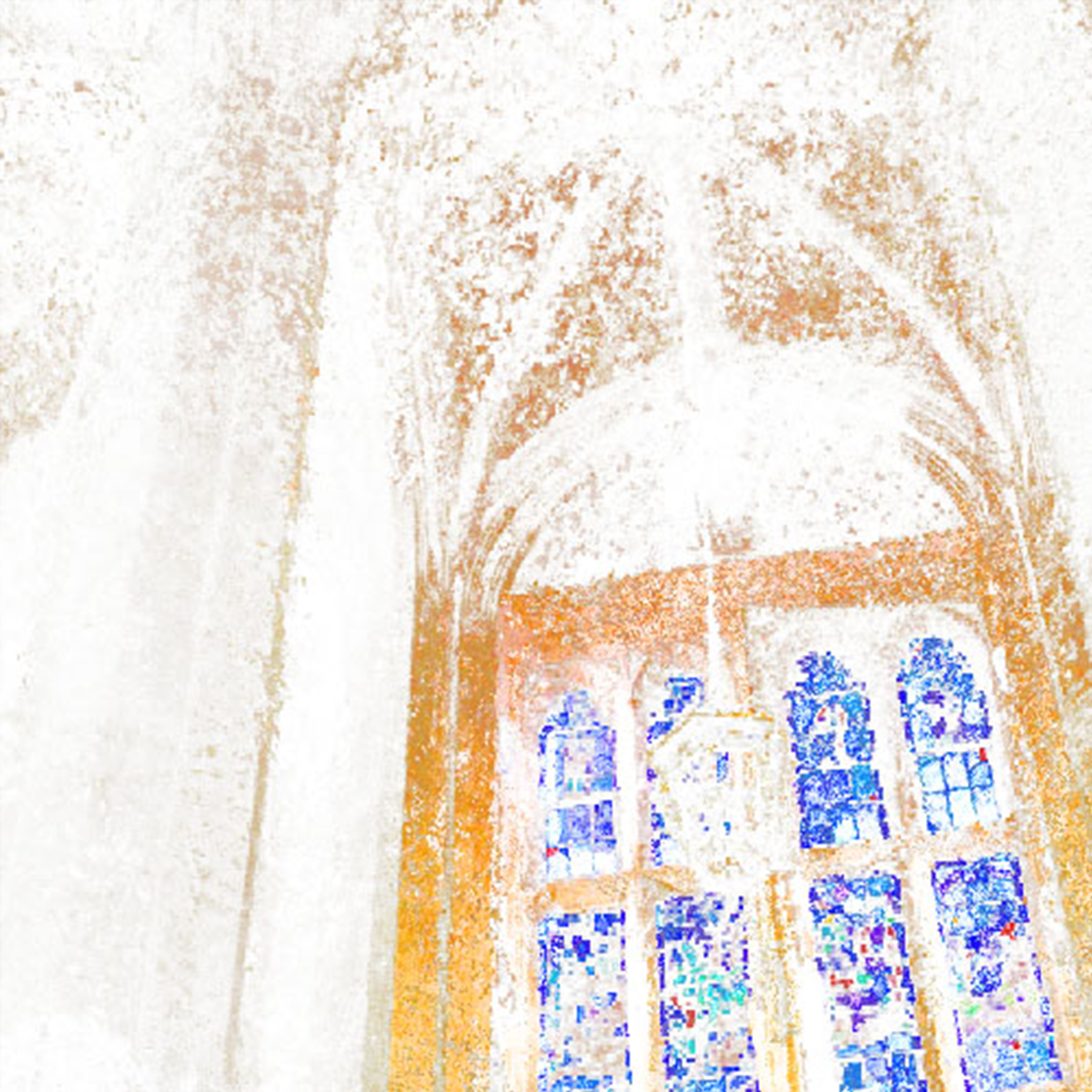
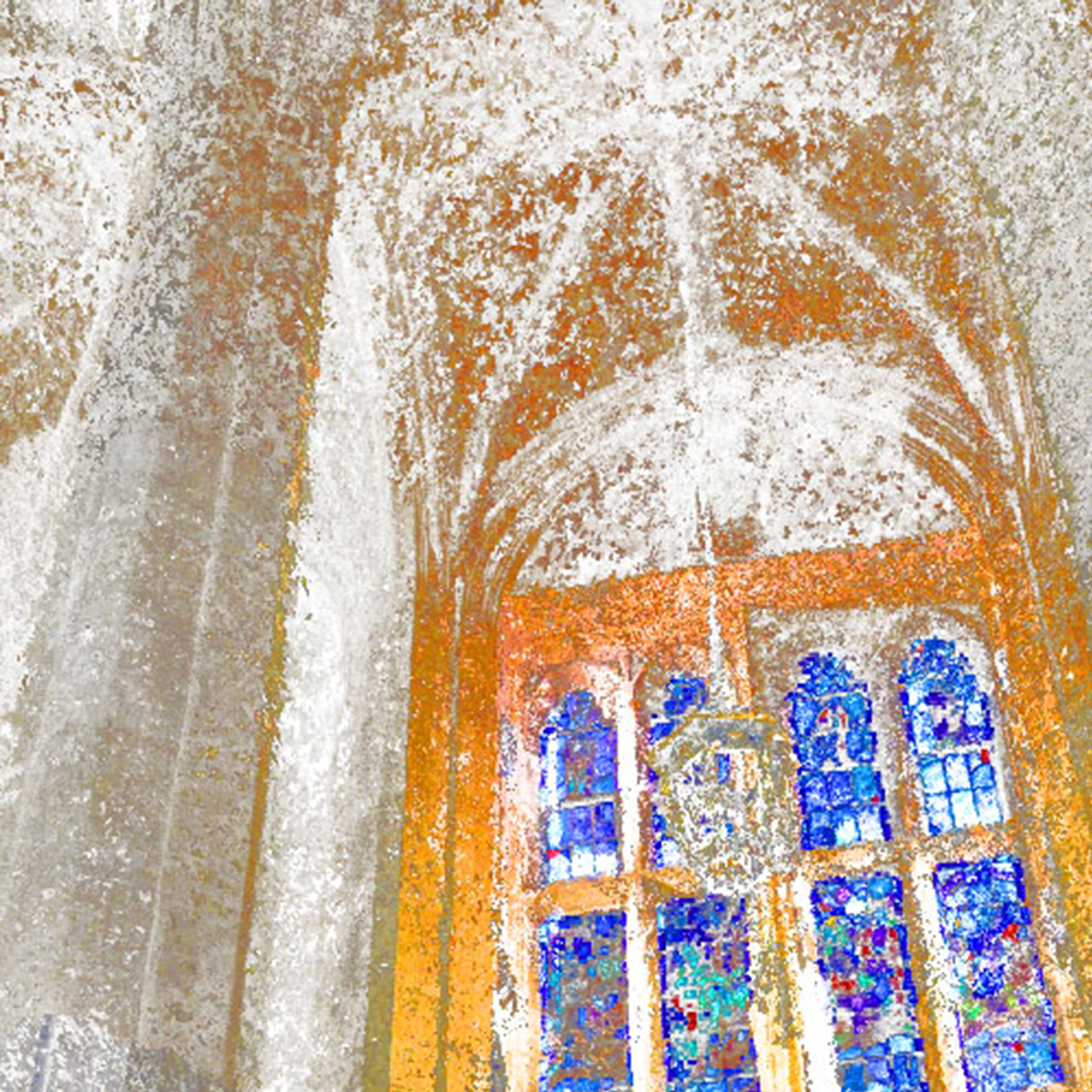


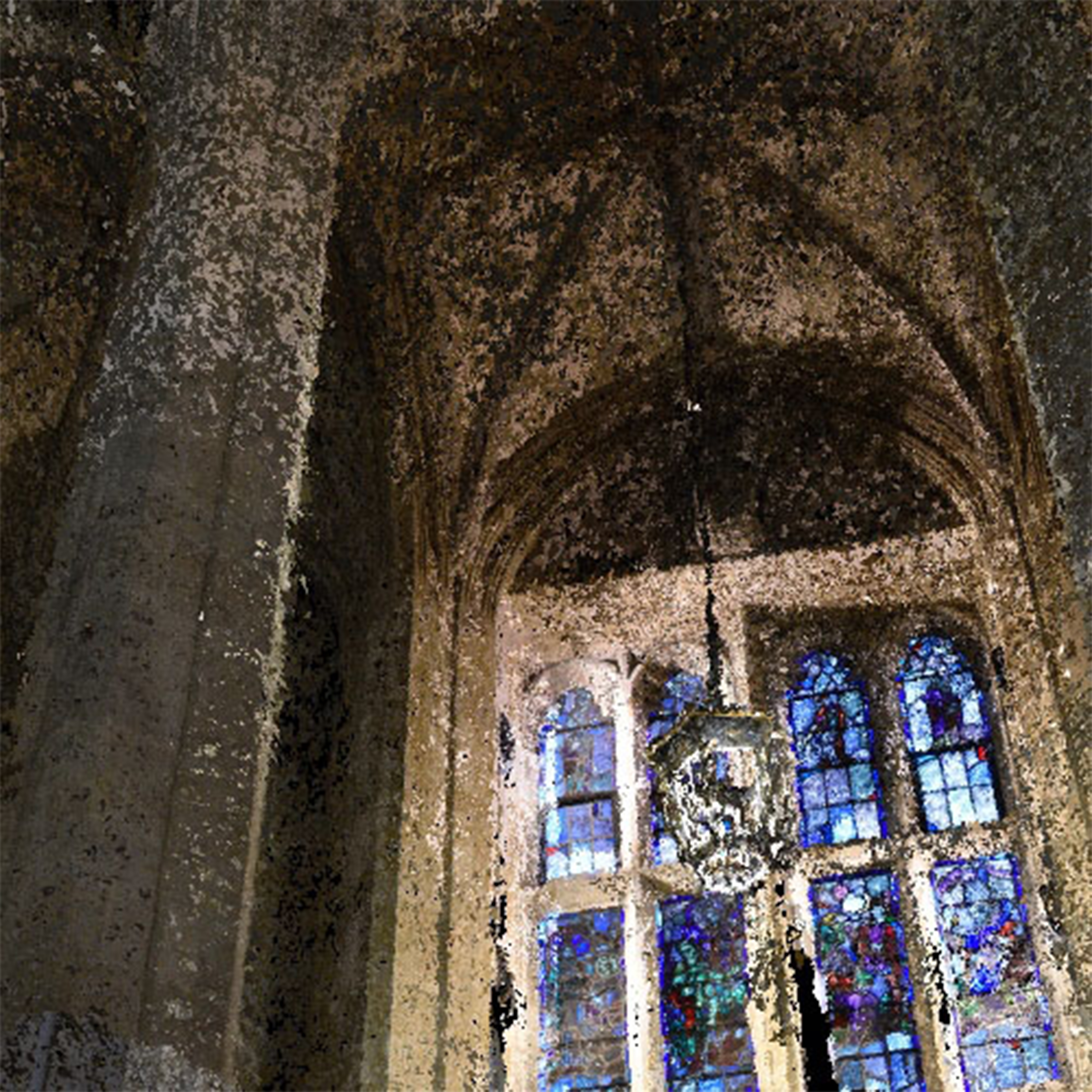

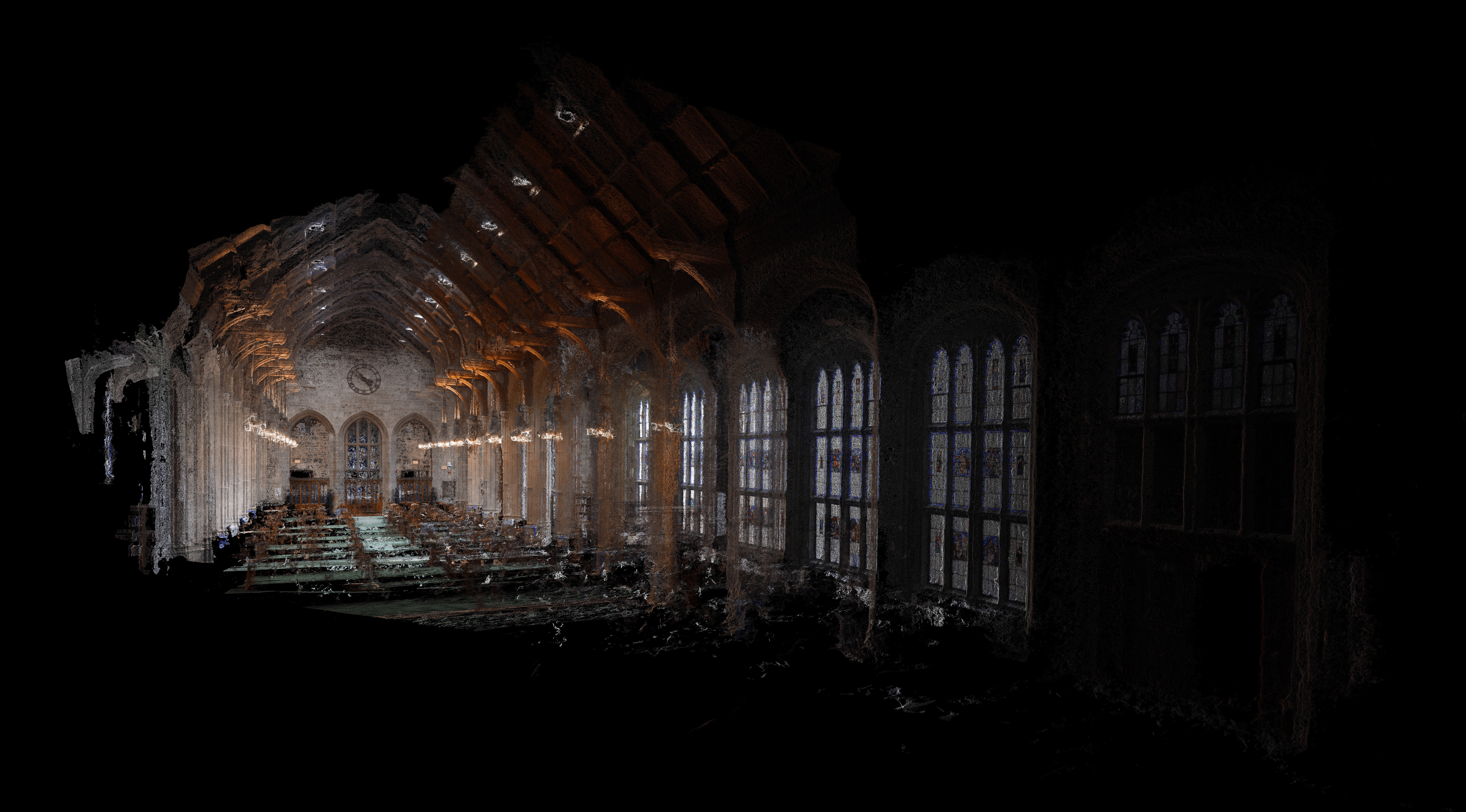
Experimenting with photogrammetry has allowed me to think about how light, colour, and density relate to material.